
Introduction
What started as a tool for researchers, evolved into one that outputs a ready-made prompt for product teams, geared for vibe coding. The goal for this phase was to turn Muxi into a profitable product, therefore it needed to provide some sort of value for its users. We asked ourselves: how might we increase user retention by creating ongoing value beyond first-time use?
For this phase of the project, I took on more of a supporting role, giving another designer the opportunity to take the lead. But together we transformed Muxi from “just a research tool” to something more.
Read more about the MVP phase of Muxi here →
Research
Navigating a shift in vision and team alignment
With a new product owner stepped in following the departure of the original project lead, the team faced a period of uncertainty and misalignment. The new product owner brought a different perspective and ideas, which shifted the direction of the project and raised questions around the target audience, product value and long-term goals.
To realign, the design team facilitated two workshops with the internal core members, dedicated to understanding the new vision, clarifying business objectives and re-evaluating our user base. While the conversations demanded a lot of brain power, we came to a mutual understanding of the new direction, enough for us to move forward. Following the sessions, myself and the other designer began to draw up the core user journeys, from product modules to a revised navigation and more. The discussions and research we conducted for this took over 1 month which cut into the original design and development schedule for which we were hoping to launch in April.
Iterations
Aligned direction
After multiple discussions, Muxi is now defined by the following:
- Muxi targets product teams who are looking to validate ideas
- Users must navigate a linear path within the modules which will guide them to provide the best possible outcome
Each module must have a purpose
While keeping most of the modules from MVP, we wanted to add more sustanance to address the business impact. So we asked ourselves, what value does this bring to the user? This is how we defined them:

Industry research
- This module provides more context into the product idea.
- What market information is necessary for the user to know before they dwell further into their idea?

Competitor research
- This module allows us to better understand who is already in this product space.
- What do we need to know about other direct or indirect competitors within the same space and what should we learn from them?
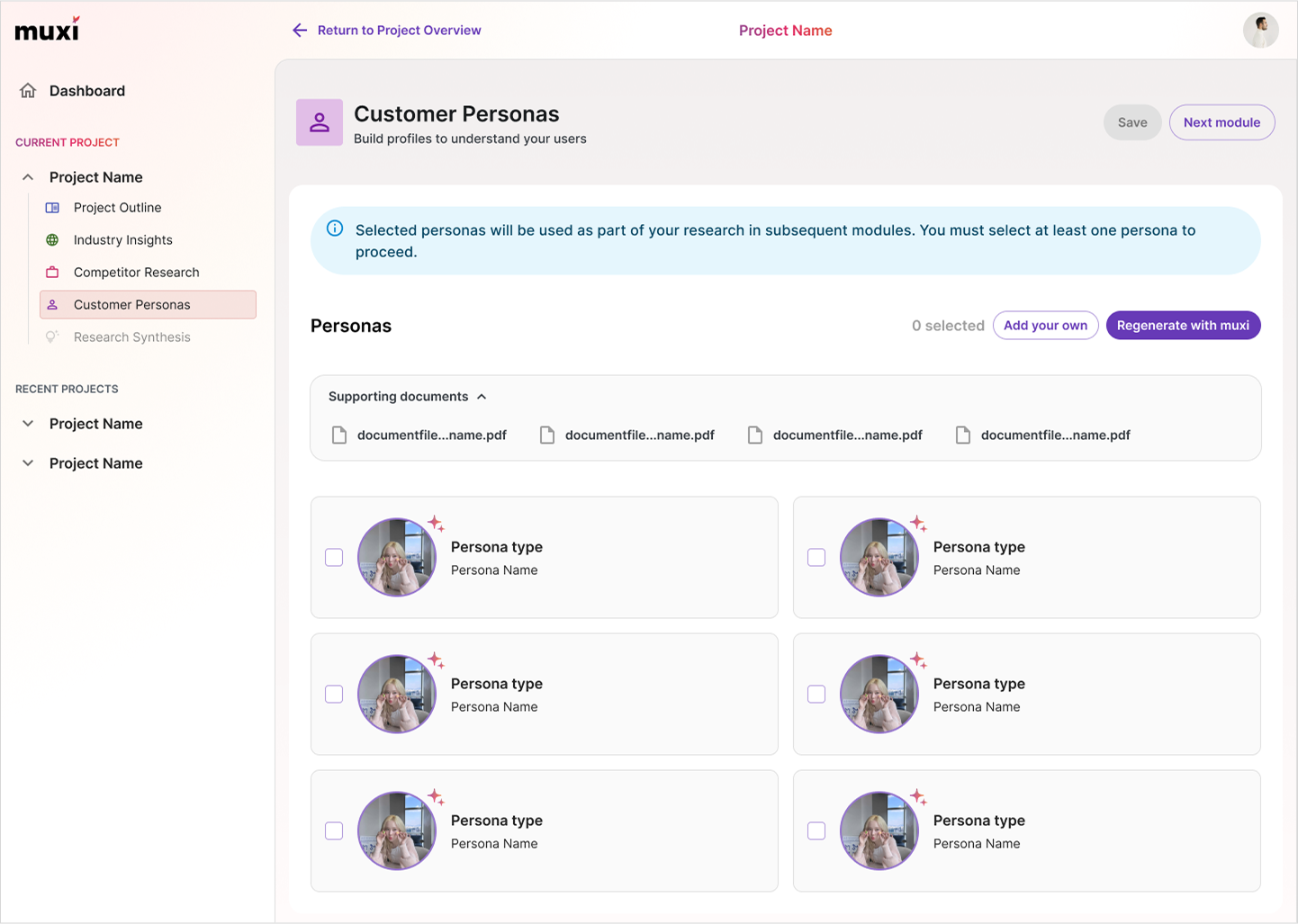
Persona generation
- This module gathers all of the information from the previous modules to define the target audience specific to our project.

Research synthesis
- This module validates and summarizes the information that was conducted from all previous modules against the original hypothesis to provide insights and to generate a product-ready prompt that can be inputed in a vibe-coding tool of choice.
Let Muxi be your guide
Initially, users were allowed to pick and choose which modules they wanted to complete. This proved to be confusing with internal testing as all options were presented with them whether they wanted to complete it or not.

In the second iteration, we had decided that it would follow a linear process but still allowing users the flexibility to choose. We thought that if the user’s goal was to create personas, then they would have to complete the modules that were needed to output personas. We were following this format for a while but after more discussions with the internal team, we came to the conclusion that there wasn’t a lot of value if that was all they were doing with this tool.

Then came the third iteration where users must complete all modules to achieve the same end goal, which is a product-ready prompt for a vibe coding tool of choice. Of course, the user doesn’t have to use it, but it is provided in the case that they do. Our assumption was that by providing users with a product-ready prompt, we could increase the tool’s value by giving them something tangible to prototype or test. This would help them move beyond abstract ideas and either validate or challenge their hypothesis through real, actionable output.

General improvements
We refined the modules so that they were more consistent with each other in ways like allowing supporting document uploads. Initially, document uploads were only available when creating personas but we thought that it could provide value for other modules because by uploading documents, it provides more context to create more defined outputs. Currently, users have to upload the documents they want at each step, but thinking ahead, this can be improved to be more of a file management system where users could instead select from previously uploaded documents.

In the MVP phase, we focused heavily on AI being a content creator, giving it more power to dictate the content of each module. While that feature is still available, it’s no longer the main focus. Instead, users are encouraged to start the process on their own. Once there is enough information, AI can then come in to refine or improve what is provided.

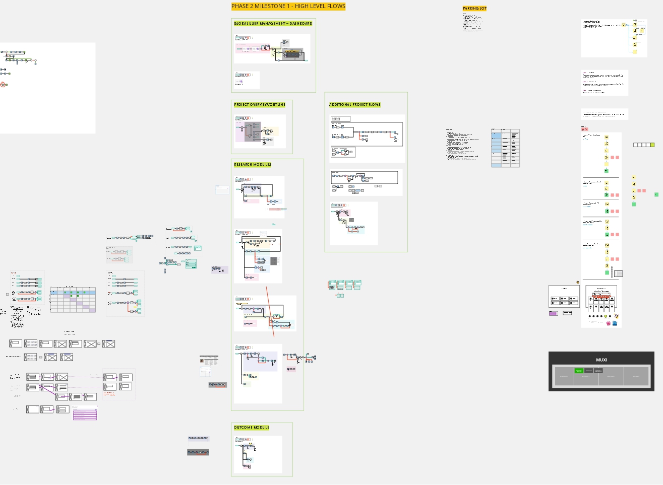
Design handoff for dev
One of the processes we have been refining over a few projects is creating an overarching page that defines global states, rules and more. This keeps the source of truth in one place for both ourselves and the developers who are working on this project.

Outcomes
Web Summit launch
The deadline nears as we prepare for the launch of Muxi at Web Summit Vancouver 2025. Speaking with and demo’ing Muxi to people who stopped by our booth, we received really positive feedback with a large number of interest and 100+ signups for our beta launch.

Reflection
Riding a bumpy journey
This project presented a range of challenges that ultimately helped me grow as a designer. Being involved from V1 through V2, I saw how critical structure and documentation are, especially when it comes to maintaining a scalable design system and enabling smooth handoffs. Especially with AI being thrown into the mix, it had its own considerations that I was learning for the first time.
Reflecting on the broader product-building process, it was difficult to navigate with the change in leadership between phases, as well as many last-minute changes that would come up. However despite these challenges, this project was a meaningful learning experience that has kickstarted my experience into AI in the tech world.