Introduction
Paladin BlueSky helps organizations deliver real-time safety alerts to people in the field. Their analysts were spending 6 minutes creating and publishing every post in a product where speed is the whole point. I led the end-to-end redesign of their web and mobile platforms, from discovery through launch, cutting that time to 2 minutes.
Key achievements
Reduced post creation and publishing time from 6 to 2 minutes
Streamlined the user interface for both internal staff and clients
Improved the speed and relevance of critical safety information delivery
Research
Cracking the code
I started with a discovery workshop to map how Paladin's analysts actually worked, not how the product assumed they worked. I built current and proposed user journey maps, created an information architecture, and ran a UX evaluation across both sides of the platform: the admin portal used by analysts, and the client-facing portal used by the people receiving alerts.


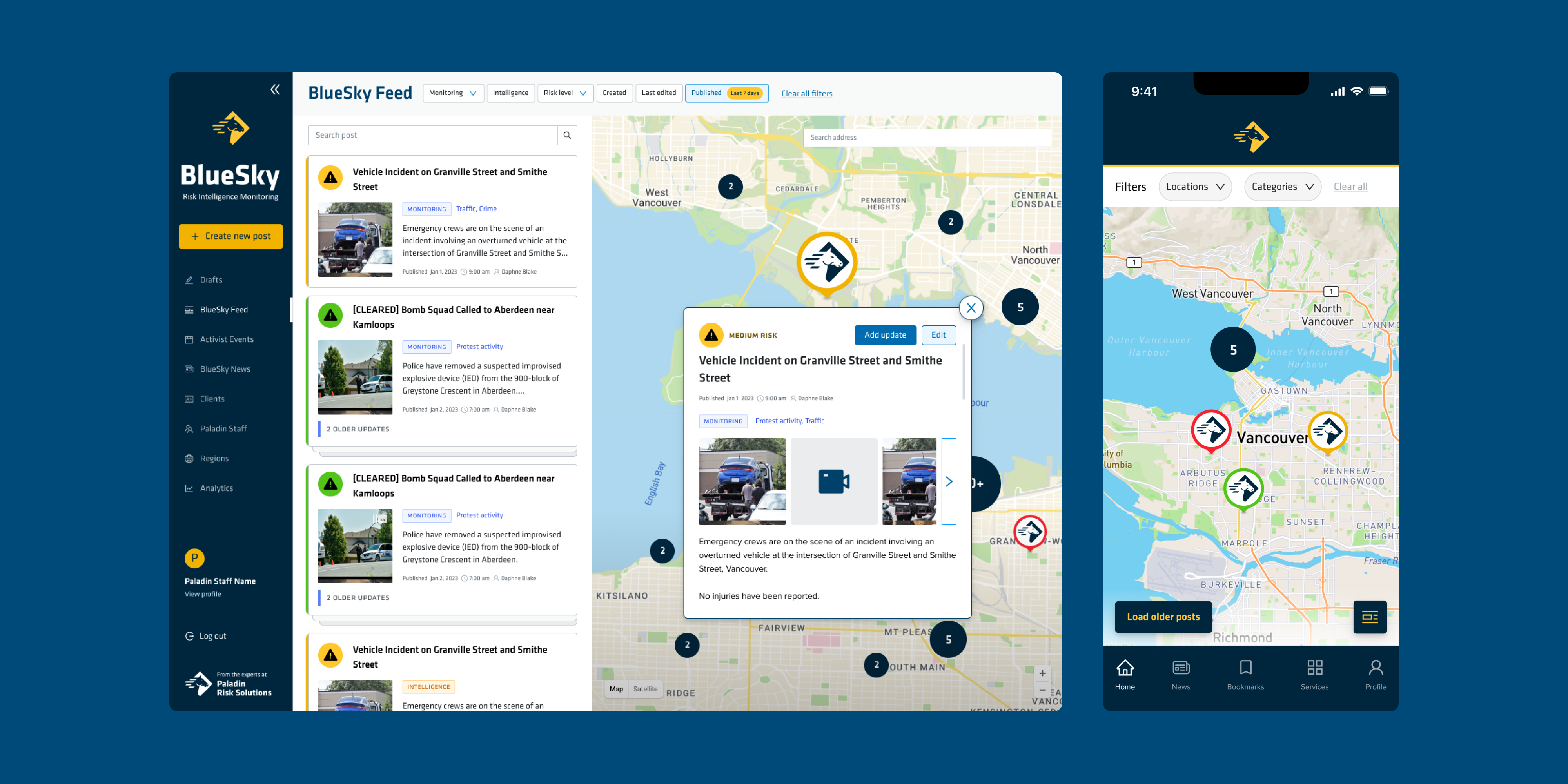
The two surfaces had different problems. On the client-facing side, filters didn't clearly show their active state and the interface lacked visual hierarchy, making it hard for clients to find relevant information quickly. On the admin side, the portal demanded too much cognitive effort from analysts, slowing down every post they created.
Since the main focus of the project was geared towards the admin portal, to go deeper on the analyst workflow, I arranged a live demo with Paladin's analysts and watched them create, upload media, and publish a post end-to-end. Seeing the real process revealed exactly where time was being lost.
Iterations
Navigating the complexity of location-based communication
I started with low-fidelity wireframes in Miro to pressure-test ideas before committing to visual design. We chose Ant Design as the UI framework to keep the build consistent and reduce engineering overhead.


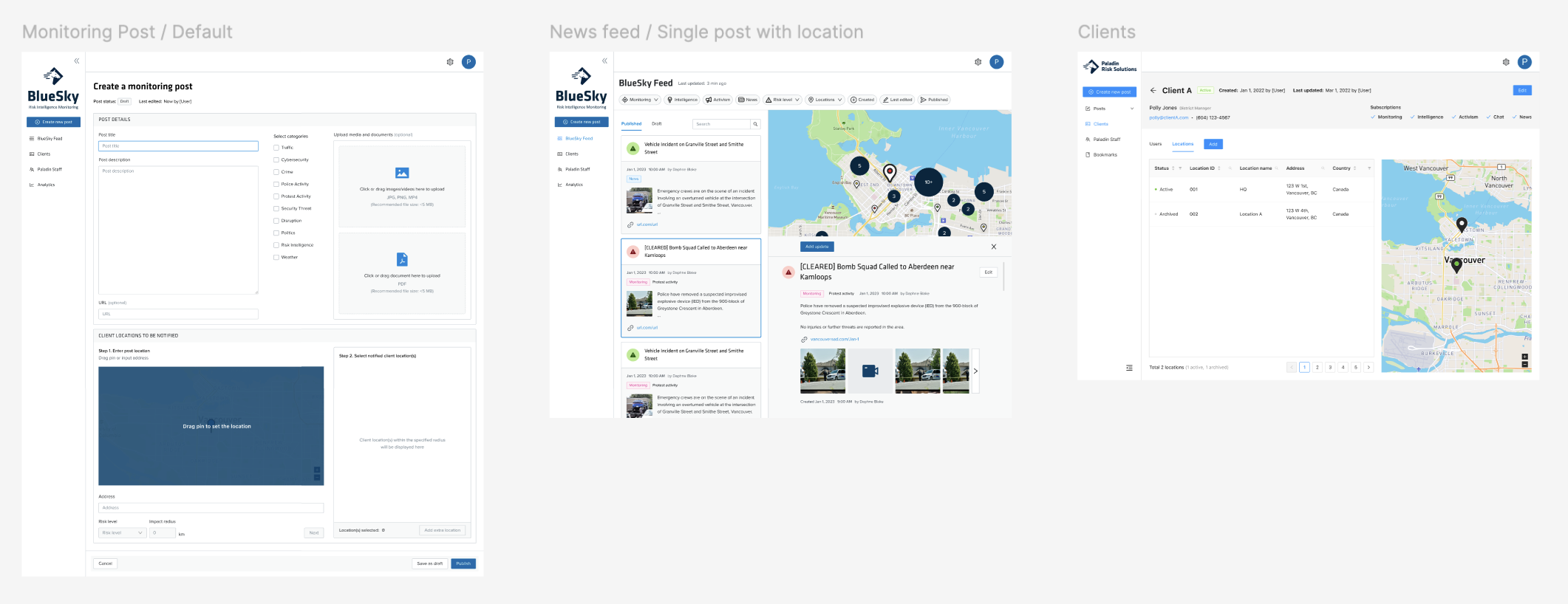
The hardest problem to solve was location assignment. Analysts needed to attach a geographic area to every post, but the existing flow was rigid and slow. I redesigned it to support three input methods: dropping a pin on a map, typing an address, or pasting coordinates, so analysts could work however was fastest for them in the moment.

The second complexity was notification logic: the system needed to determine which clients should receive an alert based on proximity and exceptions, without analysts having to manually manage that. I built safeguards into the publishing flow to prevent errors and make sure the right people got the right information.
Outcomes
Transforming security communication
The redesign shipped and is live. In user testing ahead of launch, post creation time dropped from 6 minutes to 2 — a 67% reduction! Analysts said the platform felt more intuitive and pointed to the map view as a specific improvement that changed how they work.

Beyond the core web app, I applied UX improvements to the mobile app: added an onboarding tutorial, redesigned the filter flow to clearly show active state, and addressed several smaller usability gaps that were causing confusion.


Reflection
Understanding the business impact
This project pushed me to think beyond UX into business logic, understanding how subscription tiers affected post types, and when notification rules should and shouldn't fire. Getting that right required more back-and-forth with the client than I initially anticipated, and it changed how I approach design. Now I treat business rules as something to consider in the beginning, not as an afterthought.